Budget Exhibition Stall Design: How to Look Premium Without Overspending
Budget exhibition stall design is about making smart choices, not cheap ones. The difference between a stall that looks affordable and one that looks cheap comes down to branding consistency, material quality in the right places, clean layout, and strategic use of lighting. A well-planned small budget stall can compete confidently with stalls that cost three times more.
Why Budget Exhibition Stall Design Is Not About Spending Less
Every first-time exhibitor faces the same pressure. The show registration cost a significant amount. The travel and accommodation are adding up. The stall itself feels like one expense too many.
So the instinct kicks in. Cut the stall budget. Go with the cheapest option. It is just a booth, right?
This thinking is exactly what leads to the stalls that nobody stops at.
Budget exhibition stall design is not about spending as little as possible. It is about spending what you have in the most intelligent way possible. There is a significant difference between those two things. A stall built on a tight budget by people who understand design and branding can look genuinely impressive. A stall built by people who simply chose the cheapest option at every turn looks exactly like what it is.
Furthermore, your stall is the physical face of your brand at that show. Every visitor who walks past it forms an instant opinion about your company. That opinion is difficult to change once formed. Spending a little more in the right places and cutting costs in the right places is what budget exhibition stall design is really about.
The Golden Rule of Budget Exhibition Stall Design
Before diving into specific tips, understand one principle that underpins all good budget exhibition stall design.
Spend on what visitors see first. Save on what they see second.
Visitors see your backdrop from across the hall. They see your main graphic and your lighting before they are anywhere near your stall. They see the overall structure and the colour palette from ten metres away. These are the elements that attract footfall. These are the elements where your budget should go.
They see your brochure holder, your cable management, and the back of your counter unit only when they are already standing inside your stall. These are the elements where you can save without any visible impact on how your stall is perceived from the outside.
Apply this principle to every budget decision and your stall will consistently look better than its cost suggests.
Smart Budget Exhibition Stall Design Strategies That Actually Work
Start With a Shell Scheme and Brand It Properly
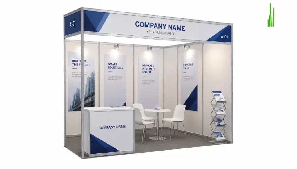
The shell scheme stall is the most budget-friendly starting point available at any trade show in India. The organiser provides the basic structure, the walls, the fascia board, and the floor covering. You pay only for the space and the branding you apply on top of it.
Most exhibitors treat a shell scheme as a limitation. Smart exhibitors treat it as a canvas.
Fabric Graphic Panels Over Standard Banners
The single most impactful upgrade you can make to a shell scheme stall is replacing the standard fabric walls with full-height printed fabric graphic panels. These stretch across the wall surface and create a seamless, professional backdrop that transforms the look of a basic shell scheme completely.
Fabric graphic panels cost significantly less than custom-built wall systems. However, they look almost as good when designed and printed well. Furthermore, they are reusable across multiple shows, which means the per-show cost drops every time you use them.
Wrap the Fascia Board
The fascia board above your shell scheme stall carries your company name in standard block lettering by default. This looks generic and indistinguishable from every other stall in the row. Replace it with a custom-printed fascia wrap in your brand colours and font. This single change costs very little and immediately makes your stall look more intentional and professional.
Invest in One Strong Visual Element
Every budget exhibition stall design needs one element that acts as a visual anchor. This is the thing that catches the eye from across the hall and makes visitors want to come closer for a better look.
It does not need to be expensive. It needs to be striking.
A large-format backlit graphic panel behind your main display area is one of the most cost-effective visual anchors available. Backlighting creates a glow that draws the eye immediately, even in a busy hall. One well-designed, well-printed backlit panel on a tight budget outperforms three mediocre standard panels every time.
Alternatively, a bold, oversized typographic headline in your brand font applied to your main wall creates visual impact through scale rather than technology. If your brand message is clear and your typography is strong, this approach costs almost nothing in terms of additional production and delivers significant visual impact.
Use Lighting Strategically
Lighting is the most underused tool in budget exhibition stall design. Most small-budget exhibitors accept the default tube lighting provided by the organiser and leave it at that. This is a mistake that costs them far more in lost footfall than the lighting upgrade would have cost.
Spotlights on Key Products
A set of clip-on or track-mounted spotlights directed at your key product display area creates a focused, professional look that immediately lifts the perceived quality of your stall. Good product lighting makes products look more premium. It draws visitors’ eyes to exactly where you want them to look. Additionally, it creates contrast between your well-lit stall and the flatly-lit stalls around you.
LED Strip Lighting for Counters
LED strip lighting installed under counter edges or inside display shelving creates a warm, inviting glow that makes your counter area look finished and considered. It costs very little to install and adds a level of visual polish that significantly raises the overall impression of your stall.
Keep the Layout Clean and Simple
A cluttered layout is the most common mistake in budget exhibition stall design. When budget is tight, the instinct is to fill every available surface with products, banners, and literature to justify the show cost. This instinct works against you every time.
Clean, open layouts always look more professional than cluttered ones. They signal confidence. They tell visitors that you know what matters and you are not trying to show everything at once. Furthermore, they make it easier for visitors to understand your offering quickly, which increases the likelihood that they stop and engage.
One Table, Not Three
Resist the temptation to cram multiple tables into a small stall space. One well-branded counter or table, positioned thoughtfully, looks more professional than three folding tables covered with everything you brought to the show. Display your hero products or service materials on that one surface and keep everything else out of sight.
Clear Floor Space
Leave clear floor space in the front of your stall. This invites visitors to step inside rather than feeling like they are intruding on a crowded space. A stall you can step into feels more accessible and more professional than one that is wall-to-wall with display items from the entrance.
Prioritise Branding Consistency Over Quantity
In budget exhibition stall design, consistency is more powerful than volume. A stall with three well-designed, brand-consistent elements looks more professional than a stall with ten inconsistent ones.
Single Colour Palette
Stick strictly to your brand colour palette across every element of your stall. Your backdrop, your counter, your literature display, your team uniforms, and your brochures should all use the same colours. Consistency creates visual unity that makes even a simple stall look deliberately designed rather than assembled from whatever was available.
One Font, One Voice
Use a single font family across all your stall graphics. Mix two or three fonts and the stall immediately looks amateur. One font, used consistently at different weights and sizes, creates a clean, professional visual hierarchy that communicates brand confidence at any budget level.
Choose the Right Stall Type for Your Budget
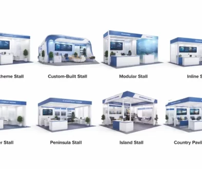
Different stall types offer different value at different budget levels. Understanding which type gives you the best return for your specific budget is a core part of smart budget exhibition stall design.
Flex Frame Stalls for Maximum Impact at Low Cost
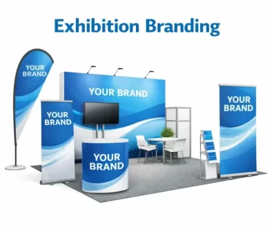
A flex frame stall uses a lightweight aluminium frame with printed fabric graphics stretched over it. The result looks clean, modern, and professional. The cost is significantly lower than a custom-built stall. Furthermore, the entire system packs down into carry bags, which saves on transportation costs between shows.
For exhibitors on a tight budget attending their first few shows, a well-designed flex frame stall is almost always the best starting point. It gives you a professional presence without the capital investment of a full custom build.
Modular Systems for Repeat Exhibitors
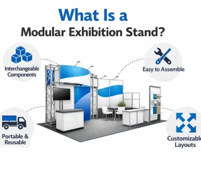
If you plan to exhibit at more than two shows per year, a modular stall system delivers better long-term value than rebuilding a shell scheme setup every time. The upfront investment is higher than a single shell scheme upgrade. However, because the system reuses across multiple shows, the per-show cost drops quickly. After three or four shows, a modular system is almost always cheaper than repeat shell scheme builds of equivalent quality.
Where to Save in Budget Exhibition Stall Design
Knowing where to cut costs without visible impact is as important as knowing where to spend. Here are the areas where saving is smart.
Furniture
Branded furniture looks impressive but costs significantly more than standard alternatives. At budget level, rent standard furniture from the venue or the organiser rather than purchasing or fabricating custom pieces. A clean tablecloth in your brand colour over a standard table costs almost nothing and looks far better than an unbranded standard table with nothing on it.
Literature and Brochures
Print only what you realistically need. Most exhibitors order far more brochures than they distribute and carry the excess home. Print a conservative quantity of high-quality materials rather than a large quantity of average ones. One well-designed, well-printed brochure in a visitor’s hand does more for your brand than ten cheaply printed ones.
Giveaways
Giveaways are often the first line item that budget exhibitors cut. This is usually the right decision when budget is tight. A giveaway that feels cheap damages your brand rather than building it. Skip the giveaway entirely and invest that money in better lighting or better graphics instead.
What to Never Cut in Budget Exhibition Stall Design
Some elements should never be compromised regardless of how tight the budget is.
Graphic Print Quality
Low-resolution, poorly colour-matched, or badly finished graphics make your entire stall look cheap. This is the one element where cutting costs has the most visible and damaging impact on your brand impression. Spend properly on design and print quality. Everything else can be simplified.
Brand Consistency
Inconsistent branding at any budget level looks worse than no branding at all. If your team uniforms clash with your stall colours, if your brochure uses different fonts from your backdrop, or if your counter colour fights with your wall graphic, the overall impression is worse than if you had done less but done it consistently.
Team Briefing
Your team is part of your stall design. A well-briefed, well-presented team standing at a simple stall outperforms an unbriefed team at an expensive one every single time. Brief your team properly before every show regardless of budget. It costs nothing and directly affects your results.
How Peacemedia Helps Budget-Conscious Exhibitors
Many exhibitors assume that working with a professional exhibition fabricator is only for large brands with large budgets. Peacemedia works with businesses at every budget level, from startups attending their first regional expo to established brands managing costs across a busy annual show schedule.
Their team helps budget-conscious exhibitors make the right spending decisions from the start. Rather than selling the most expensive solution, they design around your actual budget and identify where investment creates the most visible impact and where smart simplification saves money without compromising your brand impression.
Their flex frame and shell scheme branding services are specifically designed for exhibitors who want a professional result without a full custom-build investment.
📞 Call: +91 9024 924 924
🌐 Visit: peacemedia.in
Frequently Asked Questions
What is budget exhibition stall design?
Budget exhibition stall design is the process of creating a professional, brand-consistent exhibition stall within a limited budget by making strategic decisions about where to spend and where to save. It focuses on high-impact, visible elements like graphics, lighting, and branding consistency while simplifying or eliminating elements that have less visible impact on overall stall quality.
How can I make my exhibition stall look professional on a small budget?
Focus your budget on your main backdrop graphic and lighting first. Keep your layout clean and uncluttered. Use a single consistent colour palette across every element. Upgrade your shell scheme with fabric graphic panels rather than building from scratch. Brief your team properly and ensure they look consistent and professional. These steps create a professional impression at a fraction of the cost of a full custom build.
What is the cheapest type of exhibition stall that still looks good?
A well-branded flex frame stall or a properly upgraded shell scheme are the most cost-effective options that still look professional. Both use printed fabric graphics over simple structures. When designed well and printed at high quality, both can look impressive in a competitive show environment without the cost of a custom-built stall.
Where should I spend my budget on a small exhibition stall?
Spend on your main backdrop graphic, lighting for key products, and print quality first. These are the elements visitors see from a distance and judge your brand by before they reach your stall. Save on furniture by renting standard pieces, on giveaways by skipping them entirely, and on brochures by printing conservatively rather than in bulk.
Can a small budget exhibition stall compete with larger, more expensive stalls?
Yes, when designed strategically. A clean, well-branded, well-lit stall with a strong visual anchor and a briefed team can attract as much footfall as a far more expensive stall that lacks clear messaging or brand consistency. Budget exhibition stall design is not about matching expensive stalls element for element. It is about making the right impression in the right places.
Final Thoughts
Budget exhibition stall design is one of the most underestimated skills in trade show marketing. Anyone can spend a large budget and get a good stall. The real skill is knowing how to get a great stall out of a limited one.
The exhibitors who master this skill understand that quality of impression is not determined by quantity of spend. It is determined by where that spend goes, how consistently the brand is applied, and how deliberately every design decision is made.
Your budget is not your limitation. How you use it is.
Start with a clear objective, apply your brand consistently, spend on what visitors see first, and work with a team that understands how to make every rupee count. Do those things and your stall will look far better than its budget suggests.
Planning your first exhibition or working with a tight budget? Contact Peacemedia and get your stall design concept within 8 working hours of your brief.